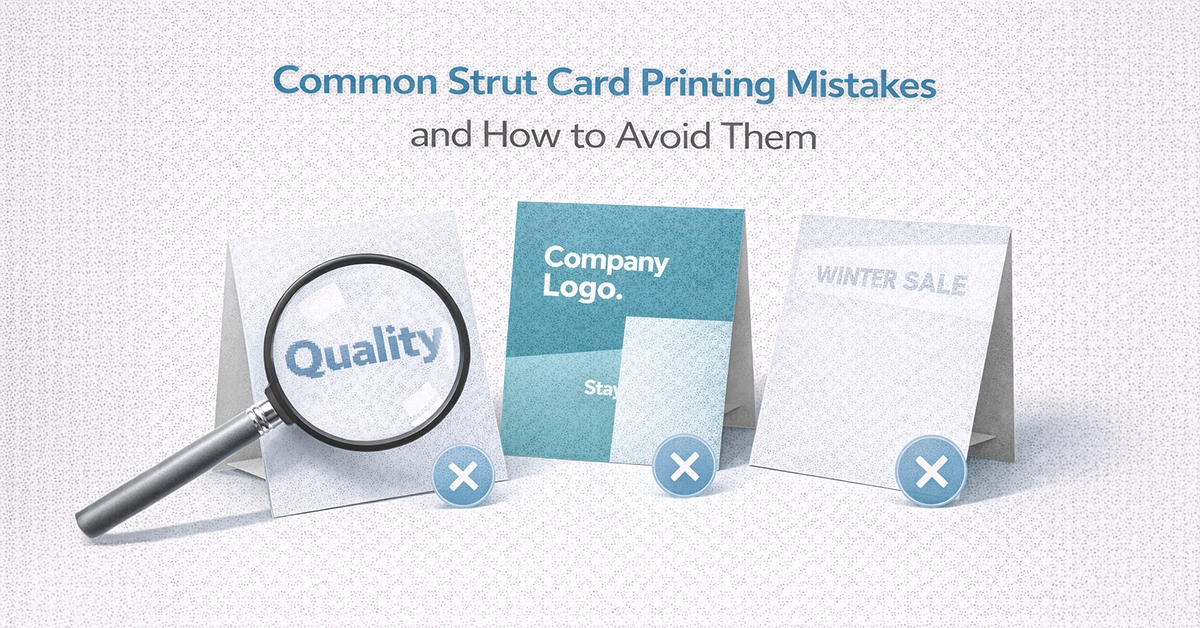
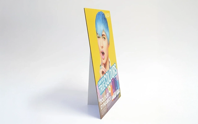
Printed strut cards are one of the most impactful point-of-sale display tools used across UK retail, hospitality, leisure and events. Their compact format, sturdy construction and eye-level placement make them ideal for highlighting offers, showcasing products or driving customer action. However, small mistakes during the design or print process can weaken their effectiveness, reduce clarity and lead to costly reprints.
This guide explains the most common strut card printing mistakes, why they happen and how to avoid them. With practical advice and clear examples, you will be able to produce strut cards that deliver strong visibility, professional quality and consistent results across every campaign.
One of the most frequent issues businesses encounter is using imagery designed for screens rather than print. Web-quality images often appear clear on a device but print with visible pixelation. As strut cards are viewed up close, low-resolution artwork is instantly noticeable and reduces overall impact.
Incorrect or missing bleed is one of the easiest mistakes to make in strut card production. Without proper bleed, trimming can leave white edges or cut off parts of your design. Safe zones also play a key role by protecting essential elements from being trimmed too closely.

Design software commonly defaults to RGB, but print requires CMYK for accurate colour reproduction. When RGB artwork is converted during printing, colours often shift or appear muted. This is especially problematic for brands with strict colour palettes.
Strut cards must communicate quickly, often within a single glance. Overloading the design with lengthy text, multiple focal points or unnecessary graphics makes the message harder to absorb and weakens overall effectiveness.
Typography influences how quickly and clearly a message is understood. Fonts that are too decorative, too thin or incorrectly sized compromise readability, especially under retail lighting or from a short distance.
This table highlights some of the most common issues encountered when producing strut cards and explains how to resolve them. Reviewing these points before artwork submission can help prevent print errors, improve visual impact, and ensure the finished display performs as intended in real-world settings.
| Common Issue | Result | How to Fix It |
|---|---|---|
| Low-resolution images | Blurry or pixelated print | Use 150–300 DPI artwork at full size |
| Missing bleed | White edges or cutting errors | Add 3 mm bleed on all sides |
| RGB colour mode | Unexpected colour changes | Design and export in CMYK |
| Overcrowded layout | Weak readability and low impact | Reduce text and prioritise hierarchy |
| Illegible fonts | Hard-to-read messaging | Use clear fonts with strong contrast |
| Incorrect material | Warping or glare | Match substrate and finish to environment |
| Poor proofing | Typos or misaligned design | Complete thorough pre-print checks |
Material choice affects how well a strut card performs in its final environment. Short-term promotions may only require lightweight board, while long-term or high-traffic campaigns benefit from sturdier substrates and protective coatings.
Effective strut cards should reinforce your wider brand identity. When colours, fonts or messaging differ from your posters, menus or online assets, the overall campaign appears fragmented.
Repeated design elements across marketing channels


Skipping proper proofing is one of the most expensive errors in strut card printing. Once printed, mistakes cannot be corrected without a full reprint, leading to wasted materials, lost time and potential campaign delays.
Print errors affect far more than aesthetics. They can directly impact marketing budgets, customer perception and environmental sustainability.
Developing a repeatable pre-print process significantly reduces the risk of errors and supports smoother production workflows.
Once the fundamentals are correct, refined enhancements can further improve engagement and visibility.
Effective strut cards depend on clarity, accuracy and strong print preparation. Avoiding these common mistakes ensures professional results, reduces waste and helps each campaign perform as intended. With the right setup and a reliable pre-print workflow, your strut cards can consistently deliver meaningful impact in busy retail and hospitality environments.
If you are planning a new campaign or preparing artwork, now is the ideal time to refine your process. Use the checklist in this guide, ensure your artwork is fully print-ready and speak with your trusted UK print specialist for guidance on substrates, finishes and artwork preparation. Thoughtful planning today helps ensure your strut cards look their best and perform effectively from the moment they are displayed.

Unit 4-10 Stanton Road Ind. Est.
Stanton Road
Southampton
Hampshire
United Kingdom
SO15 4HU