Despite the popularity of digital apps, many people still prefer the clarity and cognitive benefits of writing by hand. Recent UK research shows that a significant number of adults use both digital tools and physical stationery, with younger consumers increasingly prioritising sustainable materials. This ongoing demand creates a valuable opportunity to design printed notepads that genuinely support productivity, reinforce brand identity, and provide a satisfying writing experience.
This article explores how to design notepads that deliver on all fronts. By understanding user needs, planning page layouts with intention, and using branding strategically, you can create a notepad that becomes a daily companion rather than an occasional spare.
Every effective notepad design starts with a clear purpose. Without understanding the user, even the most attractive design can fall short in practical use.
Key questions to define your purpose:
User-centred design principles, widely referenced in government and industry guidance, highlight the importance of designing around real user needs rather than assumptions. When the purpose is clear, layout decisions, materials, and branding follow naturally.
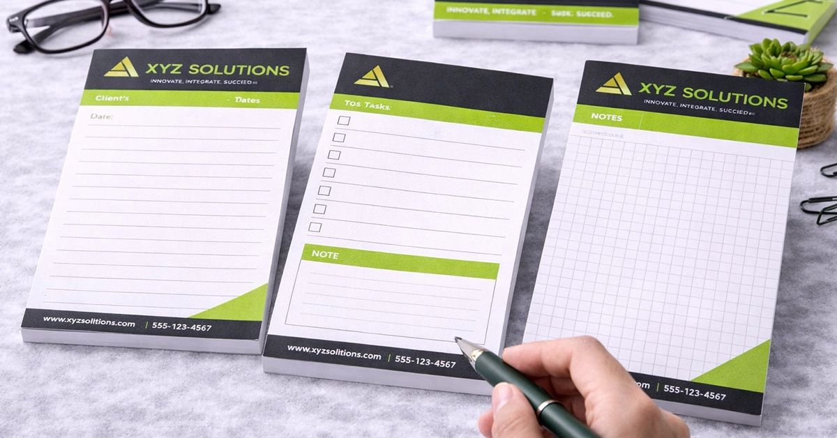
A well-planned layout determines how easy and enjoyable the notepad is to use. Even visually appealing designs can feel restrictive if the structure is poorly executed.
Popular layout options include:
Layout considerations to improve usability:
These design choices make a notepad feel intuitive from the first page.

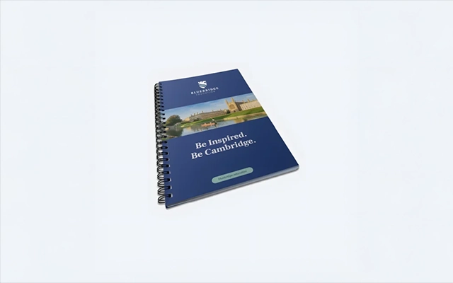
Branding in notepad design should complement the user experience rather than dominate it. The aim is to reinforce identity while keeping writing space clear and functional.
Branding recommendations:
Thoughtful branding turns an everyday stationery item into a practical promotional tool.
Paper quality and binding directly influence how a notepad performs. Smoothness, thickness, and binding style all affect writing comfort and durability.
Important considerations:
These elements define how the notepad feels in everyday use and help ensure it serves its intended purpose well.
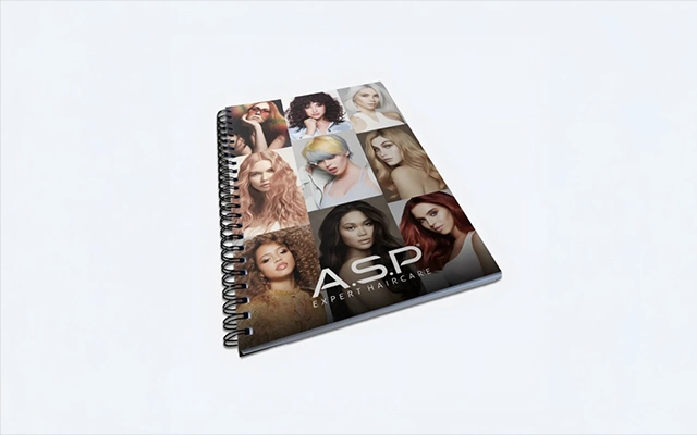
Choosing the right paper weight and binding style has a direct impact on how a notepad performs in everyday use. The table below summarises common paper and binding options, outlining when each is most effective and how it contributes to writing comfort, durability, and overall usability. This provides a practical reference for selecting materials that align with how the notepad will be used.
| Design Element | Best For | Notes |
|---|---|---|
| Ruled Layout | Meetings and daily notes | Familiar and widely used in offices |
| Dotted or Grid Layout | Planning and diagrams | Flexible without restricting creativity |
| Blank Pages | Creative thinking and sketching | Allows unrestricted idea development |
| Wiro-Binding | Desk-based and long-term use | Opens flat for improved comfort |
| Glued Binding | Quick notes and tear-off sheets | Convenient and cost-efficient |
| 80–120 gsm Paper | Most writing tools | Reduces bleed and improves clarity |
| Minimal Branding | Business stationery | Maintains a professional appearance |
| Recycled Materials | Eco-conscious audiences | Supports sustainable practices |
Functional extras can transform a simple notepad into a more effective organisational tool.
Useful design features include:
These enhancements increase usability and encourage regular use.
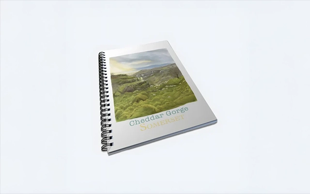
Sustainability plays an increasingly important role in UK purchasing behaviour, particularly among younger consumers.
Sustainable design options include:
Integrating sustainability into design decisions supports both environmental responsibility and positive brand perception.
Notepad design benefits from a user-centred approach. Prototyping allows improvements to be made before committing to larger print runs.
How to test a notepad design effectively:
This approach reduces risk and leads to better long-term results.
Across offices, creative spaces, and homes, notepads continue to support everyday tasks:
In every case, practical design encourages consistent use.
Effective notepad design depends on clarity, usability, material quality, and thoughtful branding. By identifying user needs early, selecting the right layout, using materials carefully, and considering sustainability, you can create notepads that offer genuine value.
If you are ready to design a notepad that supports productivity and reinforces brand recognition, now is the time to begin. Explore layout options, paper choices, and branding styles that align with your goals, and turn your ideas into a notepad people reach for every day.

Unit 4-10 Stanton Road Ind. Est.
Stanton Road
Southampton
Hampshire
United Kingdom
SO15 4HU