Colour Guide
Understanding colour modes and how they translate from screen to print is essential for achieving consistent, high-quality results. Below, we’ll guide you through the key colour systems, explain when to use each, and show you how to prepare your artwork for the best possible outcome.
- CMYK is the standard for print. Always supply artwork in CMYK to ensure colours print accurately.
- Pantone (spot) colours provide exact colour matching. Ideal for precise brand colours or specialist finishes (e.g., metallics or fluorescents).
- RGB is for screens only. Colours designed in RGB can look dull when printed unless converted correctly.
- Convert your artwork before sending. Convert all images and elements to CMYK to avoid unexpected colour shifts at print stage.
- Modern RIP technology improves conversions. Today’s systems handle RGB-to-CMYK conversions much better, especially for photographs.
- PDF export settings matter. Use Press Quality presets and correct colour settings when exporting to PDF to retain colour accuracy.

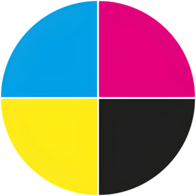
CMYK
In CMYK printing, the four inks are combined in varying percentages to reproduce a wide spectrum of colours. This process delivers excellent results for most jobs — from brochures and flyers to packaging and posters.
However, because CMYK inks can’t reproduce every colour in the visible spectrum, there are occasions when it may not perfectly match a brand’s precise shade. In such cases, a Pantone colour (also known as a spot colour) may be required.
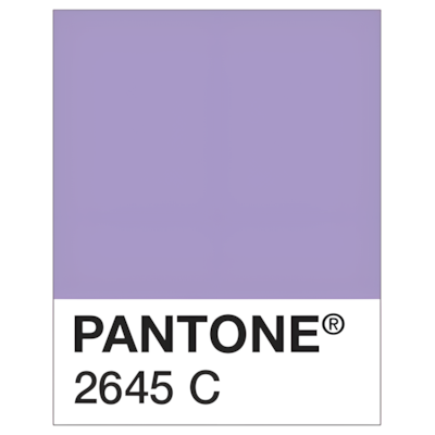
Pantone Colours
Pantone also offers specialist colour ranges, including metallics, fluorescents (neons) and pastels.
We have a five-colour press, which means we can run a CMYK job with an additional Pantone colour at the same time. If more than one Pantone colour is required, the job can be run through the press again — or, alternatively, up to five Pantone colours can be printed without CMYK.
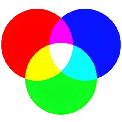
RGB
Because we cannot print in RGB, artwork must be converted to CMYK. Traditionally this could be problematic due to the unpredictable results from conversion — something that appears bright and vibrant on a backlit screen can look dull or washed out when printed.
However, modern RIPs (Raster Image Processors) are now much better at converting between colour modes, particularly for photographic images.

Colour Conversions
To avoid any unwanted surprises, convert all RGB artwork to CMYK before supplying your files.
How to convert:
Adobe Illustrator:
File > Document Colour Mode > CMYK
Adobe Photoshop:
Image > Mode > CMYK Colour, then save your file.
Saving as a PDF (Illustrator/Photoshop):
In the Save Adobe PDF dialog, ensure Colour Conversion on the Output tab is set to No Conversion.
Adobe InDesign:
When exporting to PDF, use the Press Quality preset. In the Output tab, select Convert to Destination (Preserve Numbers) and choose the appropriate CMYK profile.
Frequently Asked Questions
Screens use RGB light, while print uses CMYK ink, so colours can appear brighter on screen than on paper.
Always supply artwork in CMYK using a press-ready PDF and avoid bright RGB-only colours that can’t be reproduced in print.
We aim to match as closely as possible, but small variations are normal due to different machines, inks and paper types.
It’s not essential, but a calibrated monitor will show a more realistic preview of print colours and reduce surprises.
CMYK mixes four inks to create colour, while Pantone uses pre-mixed spot colours for exact matching—ideal for brand colours.
Use Pantone when colour precision is critical, such as brand colours, or when using metallic or fluorescent inks.
No—these require specialist inks and are only available on selected products and stocks.
We’ll convert it to CMYK, but colours may shift, especially bright or neon shades.
No—colours can look more muted on uncoated or recycled papers and more vibrant on coated gloss or silk papers.
We can get very close, but an exact match is only guaranteed when printing with Pantone spot colours.
These papers absorb more ink, reducing vibrancy and making colours appear softer or darker.