Pantone Colours
By combining different percentages of these four process colours, an extremely wide range of colours can be produced. If you were to inspect a printed image with a magnifying glass, you would see tiny dots of these colours—the dot pattern and density determine the final appearance.
However, for absolute consistency and precise colour matching, particularly across different print runs, materials, and locations, there is no better solution than Pantone colours.
- Pantone = Perfect Match: Use when exact colour consistency is essential—ideal for logos, branding and premium print.
- CMYK = Standard Print: Best for everyday printed materials; economical but may vary slightly between print runs.
- RGB = Digital Only: Designed for screens—use for websites, social media, presentations and digital graphics.
- Pantone offers special colours (e.g., metallics and fluorescents) that CMYK cannot reproduce.
- Colours look different on coated vs uncoated paper, even with the same Pantone reference.
- Pantone guides fade over time—replace every 12–18 months for accurate colour reference.
- Adding Pantone spot colours increases printing cost and setup time on a litho press.
- On a budget? Stick to CMYK or use a strong 100% primary CMYK colour for bold designs without extra spot inks.
What Are Pantone Colours?
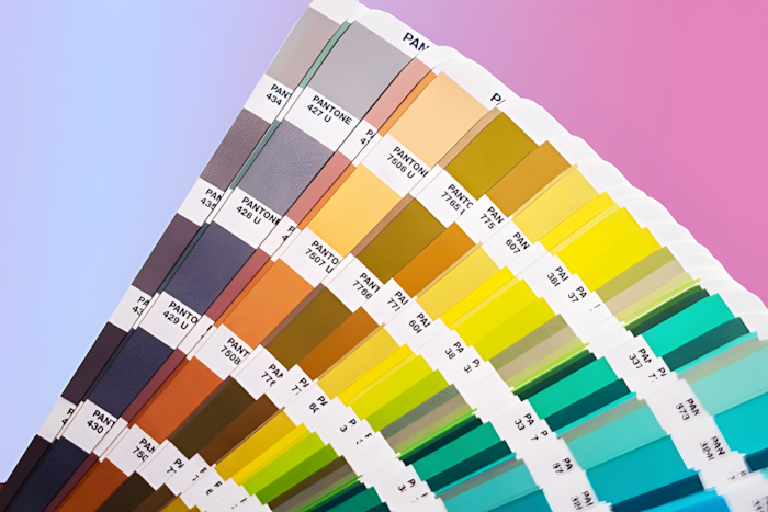
Pantone colours are identified by a unique reference number, for example, Pantone 186, Process Blue, Warm Red, or Orange 021. The standardisation of these colours is controlled by the Pantone Matching System (PMS), a global colour standard used by designers, printers, manufacturers and brands to ensure colour accuracy.
Pantone provides printed colour guides—commonly called Pantone books—which contain swatches of each colour printed on specific paper stocks. Press operators (press minders) use these guides to ensure the printed result matches the expected Pantone standard.
Why Use Pantone Colours?
- Brand Colours & Identity: Ensures a consistent brand look across all print and physical products worldwide.
- Colours Difficult to Achieve in CMYK: Some shades—especially bright oranges, rich purples, deep blues, neons, and pastels—can be difficult or impossible to replicate accurately using CMYK alone.
- Metallics & Fluorescents: Available as Pantone spot inks but impossible to reproduce realistically using CMYK.
- Small Colour Variations: Pantone eliminates risk of shift between print runs, reducing waste and brand inconsistency.
Points to Consider
Paper Types
- Coated paper (C) – has a smooth, sealed surface producing brighter, sharper, more vibrant colour.
- Uncoated paper (U) – more porous, causing ink to absorb and appear softer or duller.
Printing Press
Each Pantone colour requires its own print unit, which must be thoroughly cleaned (a “wash-up”) before use. A typical 5- or 6-colour litho press allows for CMYK plus one or two additional Pantone colours in a single pass.
For more Pantone colours, additional passes through the press may be required—adding time and cost.
Pantone Guides
- Pantone recommends replacing guides every 12–18 months.
- Printers typically update theirs regularly. Designers, agencies and brand owners should refresh guides to ensure reliable colour communication.
Metallic & Specialty Pantone Colours
Metallic Spot Colours
- Avoid printing CMYK on top of a metallic unless the metallic is knocked out beneath the text or graphic.
- Modern RIPs can auto-adjust trapping, but in design software (InDesign/Illustrator) ensure Overprint Fill/Stroke is turned off if the intention is to knock out the metallic beneath the object.
Additional Spot Colour Considerations
- Cost: Each Pantone colour adds manufacturing time and cost due to extra plates, ink, wash-ups, and press units.
- Proofing: Always request a wet proof or Pantone drawdown when absolute colour accuracy is critical.
- Environmental Inks: Pantone also supplies eco-friendly and low-VOC versions of many colours.
Budget Tips
- Use a single process colour at 100% (e.g., 100% Cyan or 100% Magenta). These are pure CMYK colours and can create bold, attractive results.
- Combine with black for contrast and dynamic, impactful designs.
Pantone vs CMYK vs RGB — Comparison Chart
| Feature | Pantone (PMS) | CMYK (Print) | RGB (Digital) |
|---|---|---|---|
| What it is | A standardised spot colour ink system used for exact colour matching | A four-colour printing process using Cyan, Magenta, Yellow and Black | A colour model for screens using Red, Green and Blue light |
| Primary Use | Branding, logos, packaging, premium print & colour-critical work | Most printed marketing materials (brochures, flyers, magazines) | Digital displays including web, apps, social media, TV, and mobile |
| Colour Creation Method | Pre-mixed ink matched to a specific Pantone number | Colour created by mixing CMYK ink percentages during printing | Colours created by mixing RGB light values on screens |
| Colour Range | ~1,800+ spot colours, including neons & metallics | Limited—cannot achieve some bright, neon, or metallic colours | Extremely wide—can produce very bright or luminous colours |
| Consistency | Highest – exact match worldwide if printed correctly | Medium – may vary between printers, presses & paper types | High – consistent across calibrated screens, but varies on devices |
| Best For | Brand identity colours, packaging, uniforms, signage, luxury print finishes | General print items where exact colour match isn’t mission-critical | Any digital graphics or on-screen visuals |
| Can Reproduce Metallics? | ✅ Yes (Pantone Metallic & Premium Metallic ranges) | ❌ No | ❌ No |
| Can Reproduce Fluorescents? | ✅ Yes (Pantone Fluorescent range) | ❌ No | ✅ On screen (but not in print) |
| File Setup | Spot colours must be set as “Pantone Spot” in artwork | CMYK values must be assigned for print artwork | Use RGB colour mode for digital artwork |
| Conversions | Converting to CMYK may cause colour shift | CMYK can be converted to Pantone, but not always a perfect match | RGB must be converted for print and may shift |
| Example Use Cases | Coca-Cola red, Tiffany Blue packaging, luxury brochures | Magazines, posters, flyers, menus, business cards | Websites, social ads, video, presentations, UI/UX |
| Output Device | Litho press, screen printing, fabric, paint, plastics, etc. | Digital & litho printers | Screens only |
Frequently Asked Questions
Yes. Screens use RGB light, while print uses ink, so colours rarely match perfectly. For accurate expectations, use physical Pantone books rather than relying on screen previews.
Yes:
- Pantone Solid = The pure spot colour ink
- Pantone Bridge = Shows the closest possible CMYK simulation of a Pantone colour
- Pantone Process = Colours intended to be printed in CMYK only
- Pantone Bridge is the most useful for designers comparing how a Pantone shade will look when printed in CMYK instead of as a spot.
Yes, but each Pantone spot colour requires its own plate and press unit. Using multiple Pantones increases print time and cost, so it’s most common in high-value print, such as premium packaging or brand collateral.
No. Pantone spot colours can vary depending on the material or surface they are printed on. Paper, plastic, fabric, metal and paint all absorb and reflect colour differently. Pantone provides specialist guides for packaging, plastics, textiles and interiors to compensate for this.
Standard digital printers cannot print true Pantone spot colours. They simulate them using CMYK (or expanded gamut systems like CMYK+OGV), which may be close but not exact. Some high-end digital presses support Pantone-certified simulation, but it still won’t match a spot ink perfectly.
A drawdown is a physical sample of Pantone ink applied to the actual stock before printing. It provides a true preview of how the colour will look on the chosen material—helpful for brand-critical projects or unusual stocks.