Images & Graphic Elements
- Use the right type of imagery for the message—photography for realism, illustrations for concepts, icons for clarity, and brand elements for consistency.
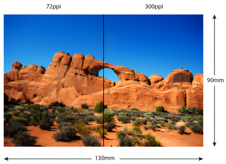
- Print needs high quality: 300 dpi, CMYK colour mode, and print-safe file formats (TIFF, EPS, PDF, high-res JPG).
- Choose images with purpose—ensure they support the message, reflect your audience, and allow space for text if needed.
- License responsibly: verify commercial rights, check release requirements, and avoid unlicensed or misused stock images.
- Prepare images for print by cropping well, adjusting colour/contrast, converting to CMYK, and sharpening before export.
- Design with balance: follow a grid, keep styles consistent, avoid clutter, and let visuals guide the viewer’s eye.
- Always proof before printing to catch colour shifts, clarity issues, or layout errors.
Types of Images & When to Use Them
| Type of Image | Best For | Why Use It |
|---|---|---|
| Photography | Lifestyle scenes, products, brand storytelling, testimonials | Builds trust and realism; conveys authenticity; shows real environments or people |
| Illustration / Cartoon | Education, storytelling, conceptual ideas, brand mascot characters | Simplifies complex concepts; allows creative expression; breaks language barriers; can soften serious topics |
| Icons & Symbols | Infographics, instructions, navigation, signage, service lists | Enables instant comprehension; ideal for universal communication; saves space |
| Logos & Brand Elements | Business identity, marketing materials, packaging, stationery | Strengthens brand recognition and consistency; ensures professional presentation |
| Graphic Shapes & Patterns | Backgrounds, framing, decorative accents, layout structure | Adds hierarchy, energy, or elegance; guides the viewer’s eye; supports brand style |
| Composite or Mixed Media Imagery | Creative ads, editorial design, event posters | Allows unique visual storytelling; combines photography, illustration, and textures |
| 3D Renderings | Product previews, architectural or technical visuals | Offers detailed visualization when photography isn’t possible or affordable |
2. Image Quality & Resolution
Technical Requirements for Print
| Requirement | Print Standard |
|---|---|
| Resolution | 300 dpi (minimum) at final print size |
| Colour Mode | CMYK for print (RGB is for screens) |
| Preferred File Types | TIFF, EPS, PDF, or high-resolution JPG |
| Vector Graphics | AI, EPS, SVG, PDF – ideal for logos & illustrations |
Important Quality Considerations
- Do not upscale small web images; quality will degrade.,/li>
- Check image sharpness at 100% zoom before placing into a design.
- Avoid compression artefacts—caused by low-quality JPGs.
- Beware of “rich black” inconsistencies—proper printing blacks may require CMYK settings (e.g., C60 M40 Y40 K100).
3. Composition & Choosing the Right Image
Key Factors to Assess
- Relevance: Does the image reinforce the core message?
- Emotion & Tone: Does it evoke the right feeling (e.g., excitement, trust, curiosity)?
- Audience Representation: Different ages, races, abilities, lifestyles—authentic representation increases relatability.
- Brand Consistency: Does the style match the visual identity?
- Negative Space / Copy-Friendly Areas: Choose images with clean areas for headlines or callouts if text will overlay.
- Eye-Flow: Images should guide viewers toward the main message or call to action.
Avoiding Common Pitfalls
- Generic or cliché stock images (forced office smiles, staged meetings)
- Overly busy or cluttered visuals that compete with text
- Mixed styles that create an unprofessional look when combined
4. Stock Images, Licensing & Legal Use
Image Sources
Image Sources
- Personal vs. Commercial Use: Commercial print almost always requires extended rights.
- Editorial vs. Commercial License: Editorial images cannot be used in ads or promotional materials.
- Model / Property Releases: Required when people, private buildings, or recognizable products appear.
- AI-Generated Images: Use cautiously—rights may vary by platform and may not guarantee exclusivity.
5. Editing & Preparing Images for Print
Essential Pre-Press Adjustments
- Crop / straighten for stronger composition
- Adjust brightness/contrast to prevent dull print output
- Convert RGB to CMYK before final artwork export
- Check colour accuracy against brand palette or physical proofs
- Remove / mask backgrounds for cleaner integration into layout
- Retouch distractions (dust, scratches, unwanted objects)
- Sharpen slightly before export (print absorbs detail)
Colour Correction Tips
- Avoid neon or highly saturated RGB colours—they don’t reproduce in CMYK.
- Soft proof in design software to preview CMYK colour shift.
- For skin tones, maintain natural warmth—avoid oversaturation.
6. Using Graphics Effectively in Layout
Best Practices
- Avoid overcrowding: Use space to create visual clarity and hierarchy.
- Maintain consistent style: Match photo filters, illustration styles, and icon weight across a project.
- Use a grid system: Ensures alignment and improves readability.
- Respect brand guidelines: Colour palette, tone, imagery style, and logo rules must remain consistent.
- Prioritise accessibility: Make sure images and graphic elements do not interfere with legibility of text.
Best Practices
- Use size, contrast, and placement to direct the viewer’s eye.
- Lead viewers from headline → key message → supporting visuals → call-to-action.
7. Final Checks
- Package your artwork with linked images or export as a print-ready PDF.
- Include bleed (usually 3–5 mm) and crop marks.
- Keep text inside safe margins to avoid trimming issues.
- Talk with us about:
- Paper type (matte, gloss, textured, recycled)
- Colour profiles (ICC profiles for calibration)
- Special finishes (spot UV, foil, embossing) that may affect image choice
Frequently Asked Questions
Images for print should be 300 dpi at the final print size to ensure they appear sharp and clear. Lower-resolution images may look pixelated or blurry once printed.
Always convert images to CMYK for print. RGB is for screens and may produce colours that printers can’t replicate, causing unexpected colour shifts.
For the highest quality, use TIFF, EPS, or PDF. High-resolution JPG is acceptable but avoid low-quality or heavily compressed JPGs.
- Vector graphics (e.g., logos, icons, illustrations) use math-based paths, so they scale up without losing quality.
- Raster images (photography) use pixels and will lose quality if enlarged.
No—not unless you have permission or a proper license. Images must be legally sourced and licensed for commercial use when used in print marketing or business materials.
Use reputable stock sites. Free options include Pexels, Pixabay, and Unsplash (check licensing). Paid, professional options include Shutterstock, Adobe Stock, and Getty Images.