Preparing leaflet design and print correctly is essential if you want your artwork to look sharp, professional and reliable. Poorly prepared files can cause colour shifts, blurry images, trimming issues and production delays. Fortunately, most problems can be avoided with the right techniques and an understanding of UK print standards.
This guide breaks down every step of preparing print-ready leaflet artwork. You’ll learn how to handle bleed, colour modes, dpi, fold panels, text settings and export formats. Visual examples are described throughout, along with fast fixes for real-world design issues.
If you create promotional materials regularly, this reference will help you achieve consistent, accurate print results.
Good artwork preparation ensures your leaflet prints exactly as expected. UK commercial prfs follow clear technical requirements that protect against trimming errors and colour inconsistencies.
Key terms to understand:
Because trimming can shift by around 1 mm, these rules make sure nothing vital is lost.
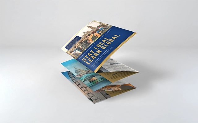
UK leaflet sizes such as A6, A5, DL and A4 folded formats each suit different content levels and layouts. When working with folded designs, panel widths must be planned carefully.
For example:
If all the panels are identical widths, the leaflet often buckles or refuses to lie flat. Adjusting the inner panel prevents this and ensures a clean fold.
Bleed, trim and safe zones form the foundation of professional artwork.
Why they matter:
A common issue involves contact details positioned too close to the edge. Moving them 5 mm inward creates a much cleaner, print-safe result.
Many leaflet design issues stem from colour mode differences.
If artwork remains in RGB, printed colours often look duller or noticeably different. Converting to CMYK at the design stage gives you a realistic preview.
Soft-proofing tools help mimic how ink will reproduce on paper. This is particularly useful for bright blues, neon shades and other colours that don’t translate directly from screen to print.

Resolution is one of the most common causes of poor print quality. For crisp, clean results, images must be 300 dpi at their final print size.
To avoid pixelation:
For example, a 500-pixel logo might appear fine on screen but will print soft and fuzzy on an A5 leaflet. Switching to a vector logo or a larger raster file fixes this instantly.
Small text requires precision to avoid misregistration or muddiness.
Follow these standards:
These settings ensure sharp text and prevent accidental colour fringing.
| Category | UK Standard / Best Practice | Purpose |
|---|---|---|
| Bleed | 3 mm on all sides | Prevents white borders after trimming |
| Safe Area | 3–5 mm inside trim | Protects text and key elements |
| Colour Mode | CMYK | Ensures accurate printed colour |
| Resolution | 300 dpi minimum | Sharp, clear images |
| Black for Text | 100% K | Prevents blurry multi-colour black |
| Rich Black | For large areas only | Produces deeper backgrounds |
| Folded Panels | Inner panel 2–3 mm narrower | Helps leaflet fold neatly |
| File Format | PDF/X-1a or PDF/X-4 | Reliable print-ready output |
| Fonts | Embedded or outlined | Avoids missing or substituted fonts |
Folded leaflets often go wrong because panel widths aren’t adjusted. Artwork must reflect how the paper will fold once trimmed.
Key guidelines:
Correct panel planning makes a significant difference in how professional the final leaflet appears.
Exporting correctly is just as important as designing correctly.
Best practice includes:
These export standards ensure your artwork passes pre-flight checks without delay.
Here are the errors designers encounter most often:
These fixes can prevent the majority of print failures.
Picture the following comparisons:
Being able to identify these issues early improves consistency and reduces reprints.
Designers often receive incomplete, low-quality or incorrectly formatted files. Here are typical scenarios:
These adjustments keep production efficient and help ensure predictable results.
Preparing leaflet artwork correctly not only improves print quality but also streamlines production. By following UK standards for bleed, resolution, colour and fold panels, you ensure your designs print cleanly and consistently.
Apply these steps to your next leaflet project and you’ll be well equipped to produce print-ready artwork that performs exactly as intended.

Unit 4-10 Stanton Road Ind. Est.
Stanton Road
Southampton
Hampshire
United Kingdom
SO15 4HU