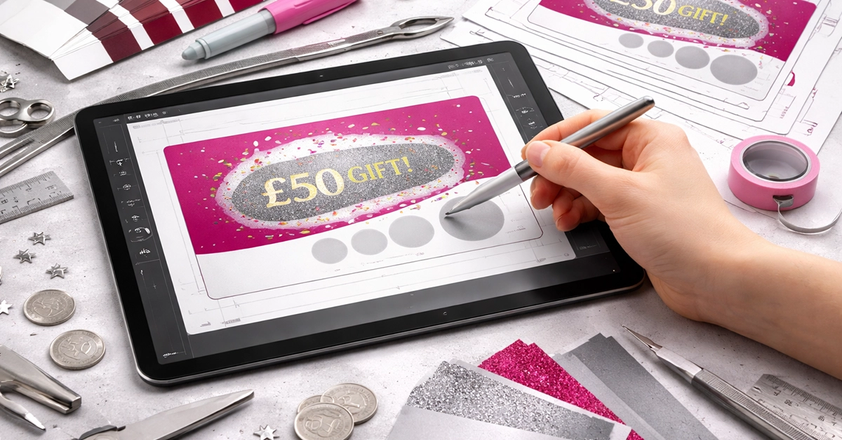
Scratch card printing remains a powerful tool for UK promotions, loyalty schemes, giveaways, and customer engagement. Their tactile nature encourages interaction in a way digital content often cannot match. However, setting up artwork for print can feel daunting if you are unfamiliar with layers, bleed, safe zones, or how scratch-off panels work.
The good news is that you do not need design expertise to create artwork that prints accurately and looks professional. This guide breaks down the entire process in clear, practical steps so you can set up scratch card artwork with confidence.
Scratch card artwork differs from standard print layouts because it includes functional elements that must align precisely. If these elements are incorrectly set up, the card may reveal information too early, become hard to scratch, or misprint entirely.
Key principles:
A clear understanding of these basics makes the design process far smoother.
Accurate document setup ensures clean print results and prevents trimming issues.
Use the following standards:
These fundamentals form the foundation of print-ready artwork and reduce the risk of errors during production.
Scratch-off panels must be built with precision so they sit cleanly over your prize content.
Follow these best practices:
A clean panel structure supports both usability and print accuracy.
The reveal layer must remain legible yet concealed until scratched.
Apply these rules:
A well-prepared reveal layer improves both appearance and functionality.
Even without design training, you can create visually effective layouts with simple techniques:
Subtle design decisions can significantly improve user experience.
| Component | Requirement | Notes |
|---|---|---|
| Document Size | Match final print dimensions | Add 3 mm bleed |
| Colour Mode | CMYK | Ensures accurate printing |
| Resolution | 300 ppi | Prevents blurred images |
| Safe Zone | 5 mm inside trim | Protects key text |
| Scratch Panels | Vector shapes; 10 mm minimum | Keep panels on separate layer |
| Panel Spacing | Minimum 4 mm | Prevents interference |
| Reveal Text | Bold, high contrast | Centre within panel |
| File Export | Press-quality PDF | Include bleed + crop marks |
| Fonts | Outline before export | Ensures consistent appearance |
When your design is complete, exporting correctly is essential for error-free printing.
Before exporting:
Export the artwork as a press-quality PDF, which preserves detail and maintains colour accuracy during production.
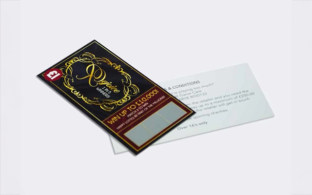
Most issues arise from simple oversights. Here are common mistakes to avoid:
Avoiding these errors improves both print quality and user satisfaction.
Thorough checks before submitting artwork help prevent delays, reprints, or unexpected results.
Review the following:
A structured approach to pre-press checks helps ensure smooth production.
Consider a small retailer preparing a weekend promotion. With no design background, they used basic design software and followed the guidelines above:
The printed cards were aligned, vibrant, and fully functional, demonstrating that professional results are achievable with clear guidance.
Scratch card artwork may seem technical at first, but once you understand the core requirements, the process becomes straightforward. Accurate setup, clean panel alignment, and a reliable proofing stage help you produce cards that function flawlessly and support the goals of your promotion.
If you are beginning a scratch card project, use this guide as your step-by-step framework. With the right structure and preparation, you can create artwork that engages customers, enhances your campaign, and prints to a professional standard.

Unit 4-10 Stanton Road Ind. Est.
Stanton Road
Southampton
Hampshire
United Kingdom
SO15 4HU