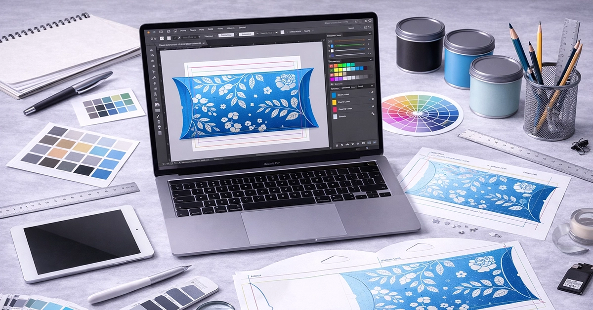
Preparing artwork for custom pillow box printing requires precision, an understanding of packaging structure, and a clear workflow. When your artwork is set up correctly, colours print consistently, lines remain clean, and your finished packaging reflects your brand with confidence. When setup is rushed or incorrect, issues like misalignment, blurred detail, or muted colour can occur.
This guide takes you through every stage of preparing print-ready artwork for pillow boxes. From working with a dieline to setting up foil layers, you’ll find practical advice to help you produce packaging files that are accurate, consistent, and ready for production.
Pillow boxes have curved edges and central folds, which makes them different from flat-panel packaging. These features mean artwork must be positioned carefully to avoid distortion.
Key considerations:
• Begin with a professionally supplied pillow box dieline
• Use industry-standard design software such as Adobe Illustrator
• Keep fold lines, glue areas, and curves in mind throughout the layout
Clear understanding of structure prevents artwork slipping across folds or distorting on curved panels.
The dieline is the foundation of every packaging design. It defines where the box will be cut, folded, and sealed, and must be followed precisely.
A typical pillow box dieline includes:
• Cut lines – boundaries for trimming
• Fold lines – curved areas that form the pillow shape
• Glue tabs – sections to keep free from important artwork
• Safe zones – recommended areas for text and logos
Keep the dieline on a dedicated non-printing layer and avoid resizing it, as even slight distortion affects assembly. For designers unfamiliar with dielines, Adobe’s packaging workflow guides offer useful technical support.
Bleed prevents unwanted white edges after trimming, while safe zones protect key content from being cut off or distorted.
Best practice:
• Add 3 mm bleed around the entire design (or as specified by your print provider)
• Extend background colours and patterns into the bleed
• Keep logos and text inside the safe zone
• Avoid placing important elements where the pillow box curves or folds
This setup ensures a clean, professional finish, even with minor trimming variations during production.
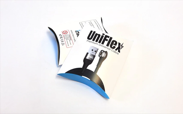
Because packaging is printed using CMYK, converting artwork from RGB at the wrong stage can produce unexpected changes. To maintain colour consistency:
• Work in CMYK from the start
• Use recognised profiles such as ISO Coated v2
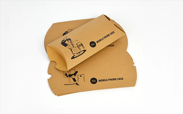
• Consider how the material will affect colour (kraft and uncoated boards absorb more ink)
• Use labelled spot colours only where required
Fogra colour standards provide helpful insight into CMYK behaviour across different paper types.
Sharp, high-quality packaging depends on correct image resolution.
Guidelines:
• All raster images should be 300 dpi or higher
• Use vector graphics for logos, illustrations, and shapes
• Avoid scaling up raster images beyond their native resolution
Poor resolution is one of the most common causes of blurred or soft packaging artwork.
| Artwork Component | Requirement | Notes |
|---|---|---|
| Colour Profile | CMYK (ISO Coated v2 or similar) | Prevents unexpected colour changes |
| Resolution | Minimum 300 dpi | Vector artwork recommended |
| Bleed | 3 mm typical | Extend backgrounds fully |
| Safe Zone | 3–5 mm inside trim | Keep text clear of folds |
| File Format | PDF/X-1a or PDF/X-4 | Outline fonts before export |
| Finishing Layers | 100% black vectors | Label clearly (FOIL, SPOT UV, EMBOSS) |
| Dieline | On a non-printing layer | Do not distort or resize |
The curved structure of pillow boxes means artwork placement must be planned carefully.
Keep in mind:
• Avoid placing logos or fine details near curved edges
• Check that text does not fall across fold lines
• Test placement using a printed mock-up wrapped around the dieline
A quick structural test using a home printer prevents costly layout errors later.
Special print finishes enhance presentation but require accurate technical setup.
Create separate layers for each finish using:
• Foil – 100% black vector shapes labelled FOIL
• Embossing/Debossing – solid black vector shapes labelled EMBOSS
• Spot UV – clean, filled vector shapes labelled SPOT UV
Avoid very fine detail, especially for foil and embossing, as these processes need clear, defined shapes.
Sustainable boards such as kraft or uncoated stock behave differently to coated boards.
Important considerations:
• Colours print more muted on kraft due to ink absorption
• High-contrast artwork performs best on textured boards
• White ink may be required to support lighter colours
• Thin typography may soften slightly on textured materials
When colour accuracy is essential, request a sample or proof.
Exporting your artwork correctly ensures smooth processing in the print workflow.
Best settings:
• Export as PDF/X-1a or PDF/X-4
• Outline all fonts
• Embed all images
• Include bleed and trim marks
• Ensure dielines are non-printing
• Keep finishing layers labelled clearly
Correct export is crucial for predictable colour, sharp lines, and accurate alignment.
Before submitting your file:
• All colours converted to CMYK
• 300 dpi images throughout
• Bleed applied on all sides
• No hidden artefacts or unused layers
• Dieline preserved and labelled as non-printing
• Spot finishes created on separate labelled layers
• All text inside the safe zone
A final pre-flight check prevents the majority of print issues encountered during production.
Real-world examples include:
• Misaligned logos placed too close to curves
• Pixelated product images due to low resolution
• Patchy foil resulting from rasterised artwork instead of vectors
• Text lost near folds due to ignoring safe zones
Understanding these issues makes it easier to avoid them.
• Keep a master file for future updates
• Confirm material choice early, as it affects colour behaviour
• Label layers clearly for faster pre-press handling
• Use proofs or mock-ups wherever possible
With these practices in place, your packaging artwork will be consistent, accurate, and production-ready.
You now have a full understanding of how to prepare artwork for custom pillow box printing, from working with dielines to adding finishing layers. Using these techniques ensures your packaging prints cleanly, maintains brand consistency, and performs well across different materials.
If you’re ready to take your packaging project forward, refine your artwork using the steps above or consult your design and print specialists for support. High-quality artwork is the foundation of standout packaging, and the right preparation makes all the difference.

Unit 4-10 Stanton Road Ind. Est.
Stanton Road
Southampton
Hampshire
United Kingdom
SO15 4HU