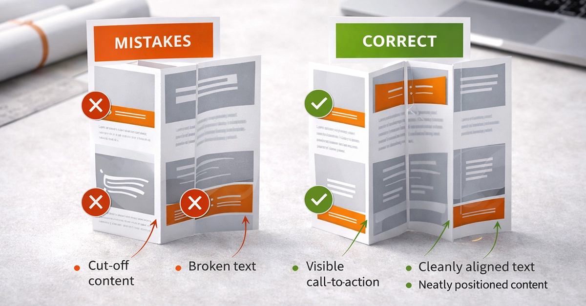
Z fold leaflets are a mainstay in UK marketing. They appear in retail promotions, restaurant menus, event guides, real estate brochures, and campaigns where brands need a compact format that unfolds into a clear, structured message. But while Z folds are versatile, they are also easy to get wrong. A small layout oversight can lead to misaligned panels, disrupted storytelling, or the expense of a full reprint.
This guide explains the most common Z fold design mistakes and how to avoid them. It includes practical layout advice, print-ready artwork guidelines, and a mid-page reference table to help designers create accurate, user-friendly Z fold leaflets.
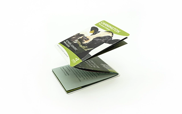
A Z fold leaflet contains three panels that fold in alternating directions to form its distinctive zig-zag shape. When opened, it reveals six equal-sized panels. Unlike tri fold leaflets, Z folds rely on consistent panel widths and a sequential flow that must be carefully mapped out.
Misinterpreting the fold direction or panel structure is the cause of most design issues. Understanding how users interact with each panel is essential to producing a leaflet that reads smoothly and prints correctly.
The following mistakes appear frequently in design workflows. Each affects readability, print accuracy, or user experience.
Panel sequencing errors are one of the biggest causes of miscommunication in Z fold leaflets. The front, back, and internal panels do not follow a simple left-to-right order. If the sequence is misunderstood, the final folded piece may reveal panels in the wrong order.
Issues caused by poor sequencing:
How to avoid it:
Sketch a flat plan before designing. Label each panel according to its final folded position to ensure that content unfolds logically for the reader.
All commercial print machinery has a trim tolerance, typically ±1 to 2 mm. Folded leaflets magnify the impact of this small shift, especially when design elements sit tightly against edges or fold lines.
When tolerance isn’t considered:
Prevent these issues:
Add generous spacing near edges and fold lines. Think of the leaflet as a physical object rather than a perfect digital layout. Minor shifts are normal, so designs need breathing room.
Applying proper bleed ensures full-coverage printing to the edge, while safe zones protect important content from risk during trimming.
Standard UK guidelines include:
Problems caused by missing bleed:
Integrating bleed and safe zones at the beginning of the design process helps maintain accuracy and prevents last-minute layout adjustments.
Fold lines interrupt visual elements. Any essential content placed across them risks distortion, reduced clarity, or broken messaging.
Typical fold-line mistakes:
Best practice:
Use fold areas for transitions or decorative elements. Keep important words, logos, and imagery entirely inside panel boundaries for maximum clarity.
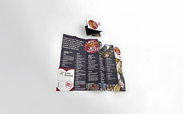
A Z fold leaflet must guide the reader through a clear, structured narrative. When panels are overcrowded, or when visual hierarchy is poorly defined, users lose interest.
To strengthen hierarchy:
Readers should be able to scan each panel in seconds and understand what it is trying to communicate.
Z fold and tri fold leaflets are often mistaken for one another, but they behave differently.
Key differences:
Start with the correct fold specification to avoid costly production errors.
High-quality print output relies on using images at the correct resolution and colour profile.
If images are unoptimised:
Use 300 dpi imagery and convert artwork to a CMYK colour profile for consistent print results.
Colour accuracy is crucial for brand consistency. Several errors can compromise print quality:
Following recommended print colour settings and checking contrast ratios improves legibility and ensures professional-looking results.
| Design Area | Common Mistake | Impact | How to Avoid It |
|---|---|---|---|
| Panel Order | Incorrect sequencing | Confusing reading flow | Map a flat plan before designing |
| Trim & Fold | Ignoring tolerance | Misaligned panels | Add spacing near folds and edges |
| Bleed & Safe Area | Missing bleed | Risk of clipped content | Use 3 mm bleed, 5 mm safe zone |
| Fold Lines | Key content placed on folds | Broken message | Keep essential elements away from folds |
| Hierarchy | Overcrowding | Poor readability | Use spacing, structured text, and flow |
| Format | Wrong template | Buckled panels | Choose a genuine Z fold layout |
| Image Quality | Low resolution | Blurry visuals | Use 300 dpi images |
| Colour | Wrong colour profile | Unexpected print colours | Convert to CMYK and check contrast |
A structured workflow helps eliminate errors before final export.
Recommended process:
This approach results in a leaflet that is visually balanced and technically sound.
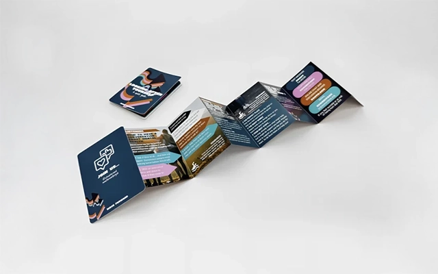

To produce clear, effective Z fold designs:
A well-structured Z fold leaflet can communicate confidently and guide the reader through the intended message with ease.
If you’re planning a new Z fold leaflet or refining an existing design, applying these principles will help ensure a clear, print-ready result. Strong structure, careful spacing, and attention to detail are the key to producing leaflets that work well in real-world marketing settings.
If you’d like support crafting artwork, reviewing layouts, or developing new concepts, now is the ideal moment to take the next step.

Unit 4-10 Stanton Road Ind. Est.
Stanton Road
Southampton
Hampshire
United Kingdom
SO15 4HU