Shelf wobblers are still one of the most effective point of sale tools in UK retail, thanks to their natural movement and ability to attract attention at shelf level. When designed well, they help brands stand out in crowded aisles, highlight key promotions and increase shopper engagement.
However, even the best wobbler concept can fall short if the artwork is unclear, poorly prepared or technically inaccurate. This guide explains how to create artwork that prints flawlessly, reinforces your brand and ensures your wobblers achieve maximum impact in store.
For further reading on POS design principles, you can explore topics such as retail buyer behaviour via the Chartered Institute of Marketing (CIM) or visual communication studies from reputable UK academic sources.
Wobblers catch the eye because they interrupt normal shelf-scanning behaviour. Their movement, shape and colour contrast give them a natural advantage over static displays, especially in fast-moving categories.
Research from organisations such as Kantar indicates that many buying decisions occur within a few seconds. Artwork that is visually strong, technically accurate and easy to process improves a shopper’s chance of noticing the message during this crucial moment.
High-quality artwork supports:
Shoppers rarely process every product on a shelf. Instead, they scan aisles rapidly and respond to visual interruptions that break their normal viewing pattern. Understanding this behaviour helps create artwork that performs more effectively in real retail environments.
Eye-tracking research by Wedel and Pieters, published in the Journal of Marketing, shows that shoppers rely heavily on quick visual scanning rather than detailed reading. Their research demonstrates that visual interruptions, movement and contrast significantly increase the likelihood of an item being noticed during this rapid scanning process.
Key considerations:
These findings reinforce the importance of bold, clear and focused artwork when designing shelf wobblers intended to influence behaviour at the point of decision.
Design determines whether a wobbler is noticed. These principles help increase visibility and ensure the message is processed quickly.
Bold, high-contrast colours stand out at shelf level and improve message clarity.
Use concise, action-driven messages. Shoppers have limited time to read and interpret details.
Arrows, badges, product imagery and prominent shapes help guide the eye.
Use approved fonts, colours and visual styles to maintain consistency across your POS suite.
Wobblers shift slightly in store, so avoid small text or intricate line work that could blur during motion.
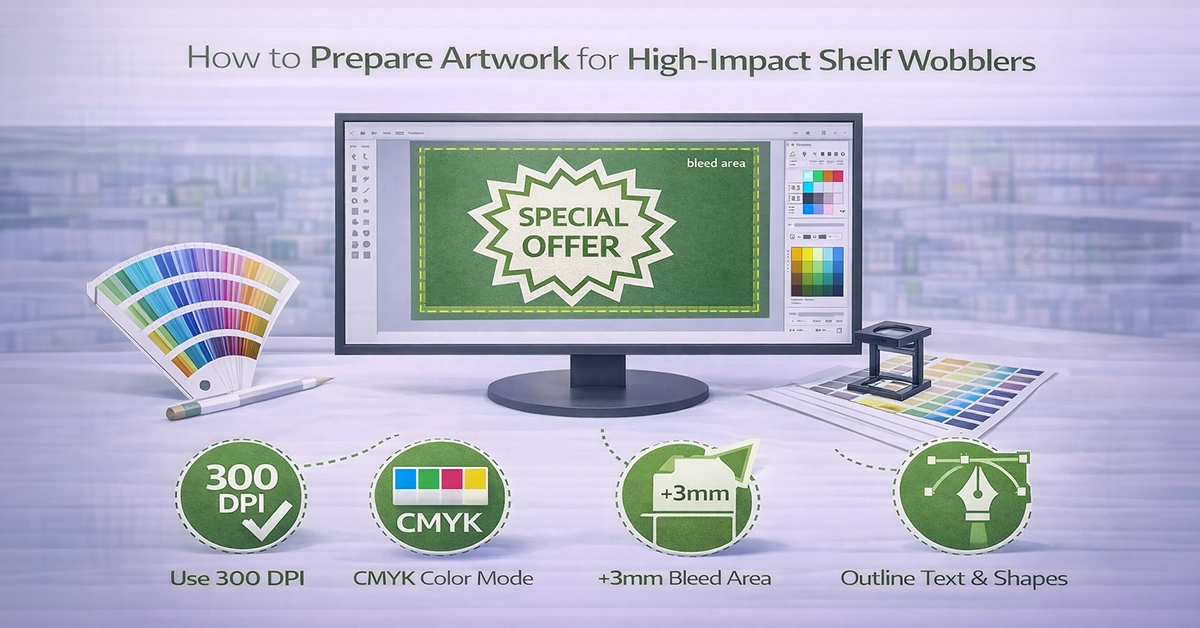
Technical accuracy ensures your artwork prints as intended. Poor setup can lead to colour issues, cropping errors or reduced legibility.
This table outlines the essential artwork specifications required for shelf wobbler printing, explaining both the recommended setup and the reason each requirement matters. It serves as a practical reference to help ensure artwork is print-ready, avoids common production issues, and delivers consistent, high-quality results in-store.
| Requirement | Recommended Specification | Why It Matters |
|---|---|---|
| Colour mode | CMYK only | Ensures accurate colour reproduction |
| Resolution | 300 dpi (images), 600 dpi (line art) | Maintains clarity and prevents pixelation |
| File format | PDF/X-1a, EPS or TIFF | Industry standards for reliable printing |
| Bleed | 3 mm | Prevents white edges after trimming |
| Safe zone | 3–5 mm inside trim line | Protects text and logos from accidental cuts |
| Fonts | Outlined or embedded | Avoids font substitution |
| Layers | Clear naming, non-print dieline layer | Helps printers process the file efficiently |
| Colour consistency | Avoid mixed RGB elements | Reduces unexpected colour shifts |
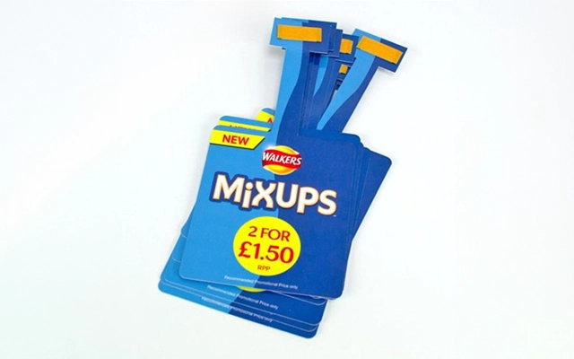
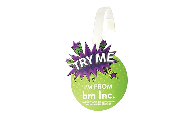
Different shapes and materials affect readability and how the wobbler performs on the shelf.
Design should remain bold and simple regardless of material, as movement may affect legibility.
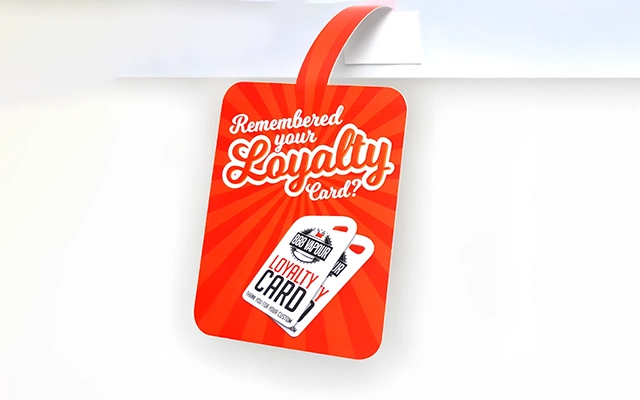

Templates ensure alignment, accuracy and correct trimming.
Best practice includes:
Clear layer structure also makes the artwork easier for printers to process.
Avoid these frequently seen pitfalls:
A structured pre-flight check helps prevent most issues before submission.
Before exporting your file, ensure:
These steps significantly reduce the likelihood of printing errors or delays.
Well-prepared artwork doesn’t just look better – it directly improves retail outcomes. In categories where products compete for attention, wobblers with sharp, clear and strategically designed artwork consistently perform better.
Examples include:
These are all scenarios where shoppers rely heavily on quick visual cues to make decisions, making well-executed artwork an essential advantage.
Strong artwork preparation ensures shelf wobblers do what they are designed to do – capture attention, communicate clearly and support in-store results. Whether you’re promoting a new product or refreshing your POS materials, following these principles will help your wobblers stand out where it counts.
If you’re ready to take the next step, now is the ideal time to prepare your artwork and explore your printing options. For expert guidance, reliable production and support throughout your project, reach out today and start building wobblers that work hard for your brand.

Unit 4-10 Stanton Road Ind. Est.
Stanton Road
Southampton
Hampshire
United Kingdom
SO15 4HU