If you are looking to print a banner, preparing artwork correctly is essential for producing professional, print-ready designs. Even the most eye-catching visuals can fall short if the technical setup is wrong. Missing bleed, low resolution or incorrect colour modes often lead to white borders, pixelation or unexpected colour shifts. For UK businesses creating promotional displays, shopfront signage or event graphics, understanding these artwork fundamentals ensures your banner prints exactly as intended.
This guide explains how to set up banner artwork properly, covering bleed, resolution, colour management, safe zones and essential pre-press checks. By following these steps, you reduce the risk of errors, save time and achieve consistently high-quality results.
Bleed, trim and safe zones form the structural foundation of print-ready artwork. If they are set up incorrectly, even a great design can fail once it reaches production.
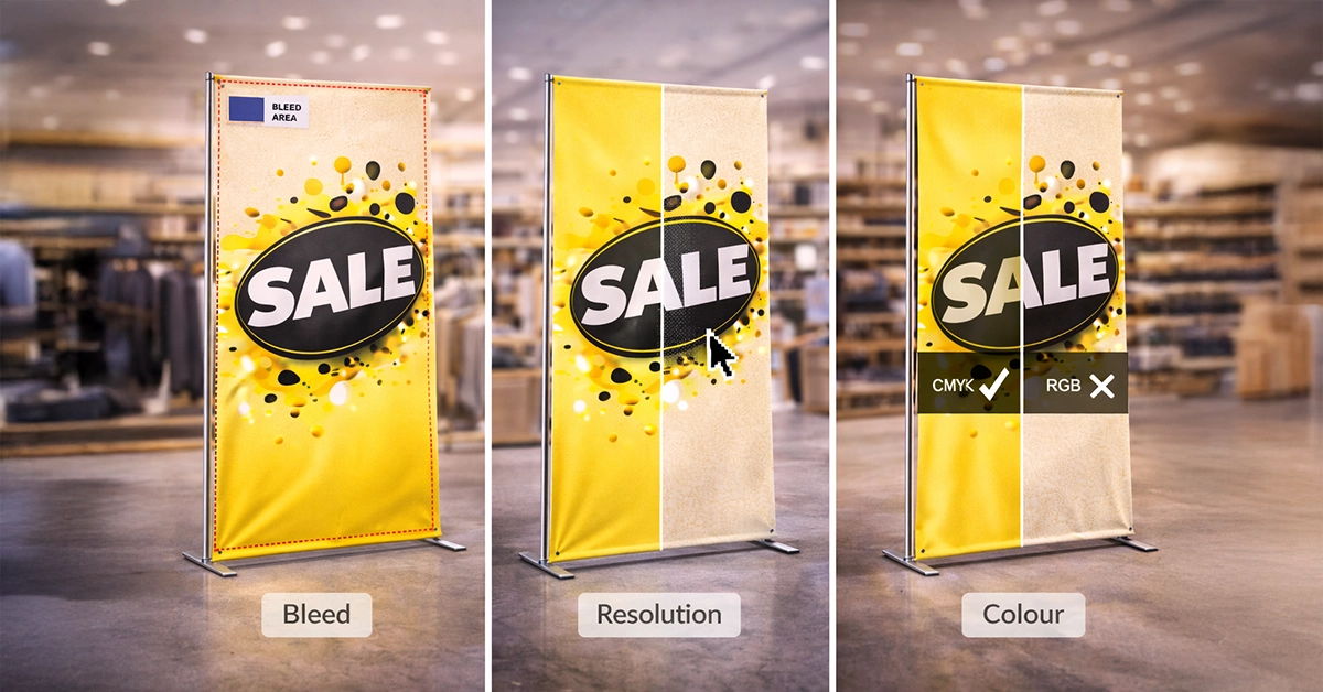
Bleed is the extra area added beyond the edge of your artwork. It allows for small movements during the cutting process and prevents visible white edges. For banners, which often involve trimming, hemming or eyelet placement, bleed typically needs to be around 5 mm or more. Always extend backgrounds and imagery fully into this bleed area.
Safe zones sit inside the trim line and ensure essential elements such as text, logos and callouts remain clear of edges and finishing features. Without a clear safe zone, graphics may appear cramped or risk being trimmed.
Trim lines mark the final cut, while crop marks guide printers during trimming. These should be placed outside the bleed area and should not appear within the visible design space.
Resolution influences the clarity of your printed banner. The goal is to maintain sharp detail while keeping file sizes practical for production.
DPI (dots per inch) determines how finely your artwork is printed. Unlike small-format products such as brochures or leaflets, banners are viewed from several feet away, meaning they do not require extremely high resolutions.
Vector graphics remain crisp at any size, making them ideal for logos, icons and text.
The table below provides a quick reference to the essential specifications required for high-quality banner artwork.
| Specification | Recommended Setting | Notes |
|---|---|---|
| Bleed | Approx. 5 mm | Extend all backgrounds into bleed. |
| Safe Zone | 20–40 mm inside trim | Keep all key content well clear of edges. |
| DPI | 150 DPI minimum | Increase DPI for close-view graphics. |
| Colour Mode | CMYK | Ensures accurate and consistent print colour. |
| File Format | Print-ready PDF | Embed images and outline fonts. |
| Images | High-resolution or vector | Avoid stretching raster files. |
| Fonts | Outlined or embedded | Prevents substitution issues. |
Colour accuracy is one of the most common challenges in large-format printing. Screens display colour using light (RGB), while printers use ink (CMYK), so artwork must be designed using the correct colour model.
CMYK reflects the inks used by printing presses. Artwork created in RGB may appear vibrant on-screen but often prints duller or drastically different. Switching your document to CMYK at the start of your design process ensures colour consistency throughout.
If your banner design uses brand-specific colours, ensure they are defined using accurate CMYK values. While some projects may rely on spot colours, banner materials vary in how they absorb ink, so always check with your printer if accuracy is critical.
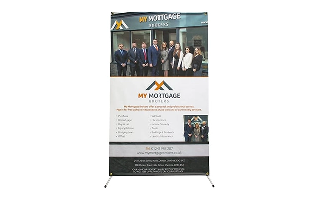
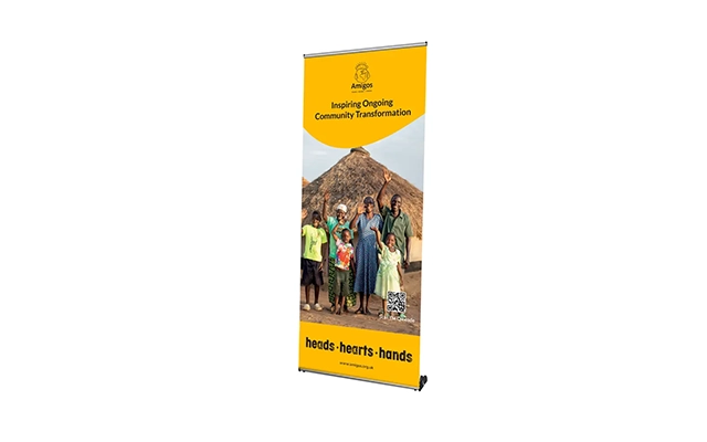
Following a structured process ensures your banner artwork is technically sound and truly ready for production.
Even experienced designers can encounter issues when preparing large-format artwork. The problems below are the most common causes of delays and reprints:
Taking a few minutes to run through a final technical checklist significantly reduces the risk of errors.
High-quality banner artwork demonstrates precision, balance and accuracy. A well-prepared file will:
Poorly prepared artwork often suffers from cropped text, dull colours and stretched images once produced. Ensuring technical accuracy results in a polished, reliable finished product.
Setting up banner artwork correctly is a straightforward process once you understand the essential components. Bleed, resolution and colour mode each play a vital role in how your design prints, and applying these principles ensures banners that look sharp, accurate and professional.
If you’re planning your next display or promotional campaign, now is an ideal time to refine your artwork and ensure it meets best-practice print standards. Whether you’re designing for retail, events or outdoor advertising, strong technical preparation helps your banner achieve the clarity and impact your brand deserves.
Ready to produce banners with accuracy and confidence?
Start applying these guidelines today and ensure your artwork prints to the highest standard.

Unit 4-10 Stanton Road Ind. Est.
Stanton Road
Southampton
Hampshire
United Kingdom
SO15 4HU