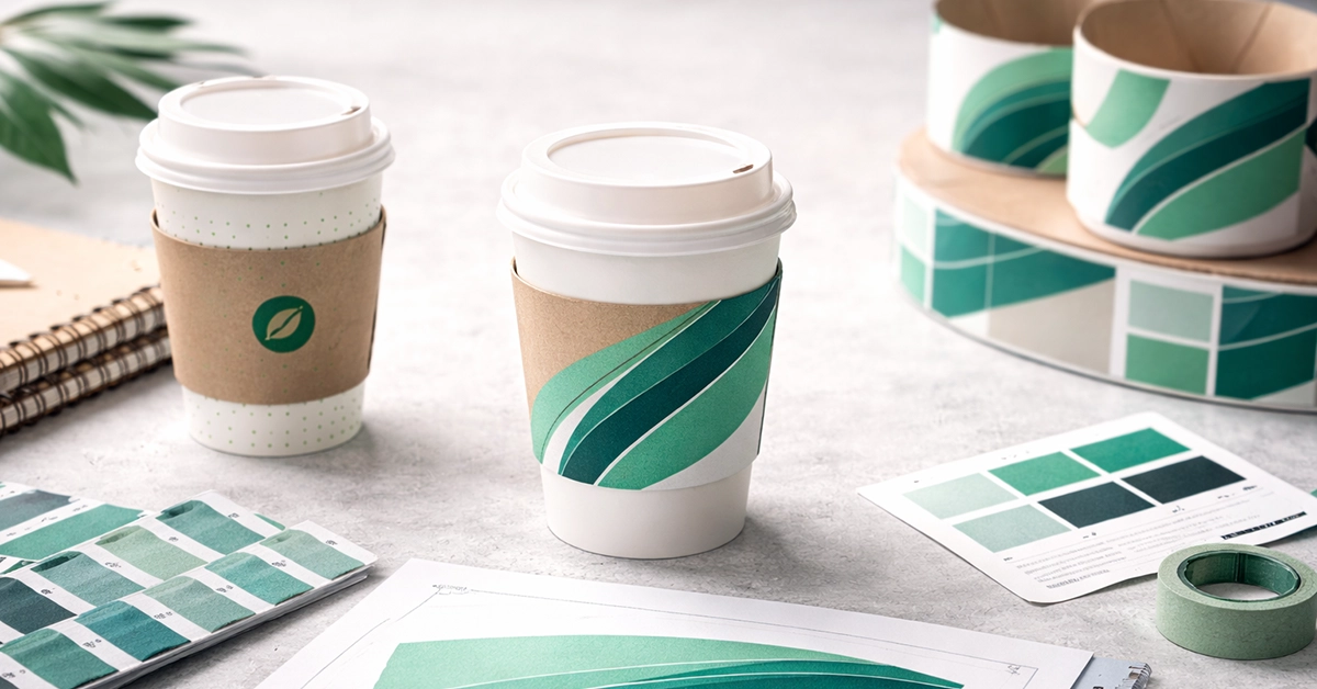
Preparing artwork for printed coffee cup sleeves is a critical step in producing consistent, high-quality packaging that supports your brand. Whether you run a café, retail shop, hospitality group, or pop-up event, understanding how to create print-ready artwork helps ensure your sleeves look professional and remain true to your brand identity. This tutorial provides clear, practical guidance for UK buyers looking to prepare cup sleeve artwork correctly the first time.
Cup sleeves wrap around curved surfaces, so artwork must be carefully designed to avoid distortion, misalignment, or colour issues. Proper preparation ensures your designs print cleanly, colours remain accurate, and branding appears consistent across every print run. Good artwork setup also reduces production delays and the risk of costly revisions.
Consumer research highlights the influence of packaging on purchase behaviour. For example, a study reported that 73% of shoppers rely on packaging when making buying decisions, with packaging playing a key role in whether they choose one product over another. This reinforces how impactful well-designed and accurately prepared cup sleeve artwork can be for brand recognition and customer engagement. (Redpack)
These insights confirm that cup sleeves are more than functional heat barriers. When artwork is prepared correctly, they help enhance brand visibility and contribute to positive consumer impressions that can influence purchase behaviour.
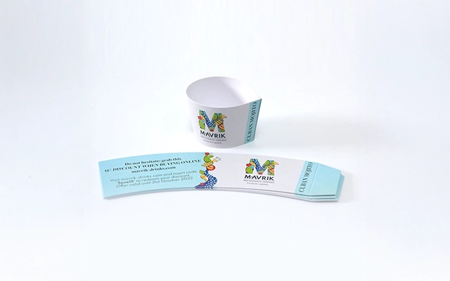
A cup sleeve design must always begin with a printer-supplied template, often called a dieline. This acts as a technical map for your design, outlining every fold, trim, and glue point.
A typical cup sleeve dieline includes:
Working directly on the dieline ensures your artwork fits perfectly and accounts for the sleeve’s curved shape. This prevents common issues such as cut-off text, misaligned logos, and stretched graphics.
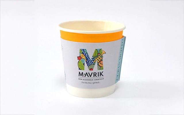
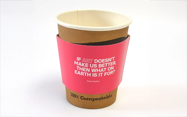
Preparing artwork with the correct colour mode, resolution, and formatting is essential for smooth production and professional results.
Cup sleeves print in CMYK, not RGB. Designing in CMYK ensures your colours stay consistent and predictable once printed.
High-resolution images prevent blurring and maintain detail, especially on kraft or textured stocks.
Preferred formats include:
TIFF and high-resolution PNG files are acceptable for photography. JPEGs should be avoided whenever possible due to compression issues.
Outlining fonts prevents unexpected substitutions. Embedding linked images ensures there are no missing files during pre-flight checks.
Cup sleeves must wrap cleanly around a cup without distorting the artwork. To ensure a clean result:
For kraft or textured materials, choose darker or high-contrast colours to maintain readability and visual impact.
Take a look below at our clear artwork checklist for cup sleeve printing, helping designers avoid errors and ensure consistent, high-quality results.
| Artwork Element | Requirement / Recommendation |
|---|---|
| Colour Mode | CMYK |
| Minimum Resolution | 300 DPI |
| Bleed | 3–5 mm |
| Safe Zone | 3 mm inward from trim |
| File Formats | AI, EPS, PDF (preferred); TIFF or PNG acceptable |
| Fonts | Outline before exporting |
| Images | Embed all linked assets |
| Colour Matching | Pantone or CMYK |
| Material Consideration | Use high contrast for kraft or textured sleeves |
| Curved Surface Adjustment | Avoid placing key elements on edges or glue tab |
Cup sleeve artwork should be clear, legible, and aligned with your brand.
McKinsey’s packaging research shows that strong branded packaging increases perceived value by 20 to 30%, reinforcing how impactful well-designed sleeves can be.
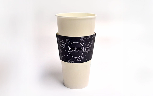
Before submitting artwork for printing, complete the following checklist:
Accurate file preparation ensures faster production, clearer communication with your printer, and consistent results across print runs.
Many artwork issues stem from skipped steps or incorrect assumptions. Avoid:
Correcting these in advance saves time and reduces the risk of artwork being returned for revision.
Investing time in proper artwork preparation ensures your cup sleeves print accurately and consistently. When artwork is set up correctly, you benefit from smoother production, reduced design costs, and stronger brand presence across every cup your customers hold.
If you’re planning a new cup sleeve design or want support preparing artwork for print, now is the ideal time to get started. Reach out to request a sleeve template, discuss print options, or submit artwork for review so you can move confidently into production.

Unit 4-10 Stanton Road Ind. Est.
Stanton Road
Southampton
Hampshire
United Kingdom
SO15 4HU