Box sleeve printing plays a crucial role in product packaging. They protect the box, communicate brand identity, and often form the first physical interaction a customer has with your product. However, even the strongest design can fall short if the artwork is not set up correctly.
Artwork setup issues are one of the most common causes of print delays, unexpected reprints, and disappointing results. Fortunately, most of these problems are avoidable. This guide breaks down the most frequent artwork errors found in box sleeve printing and explains how to avoid them, helping you save time, reduce waste, and achieve consistent print quality.
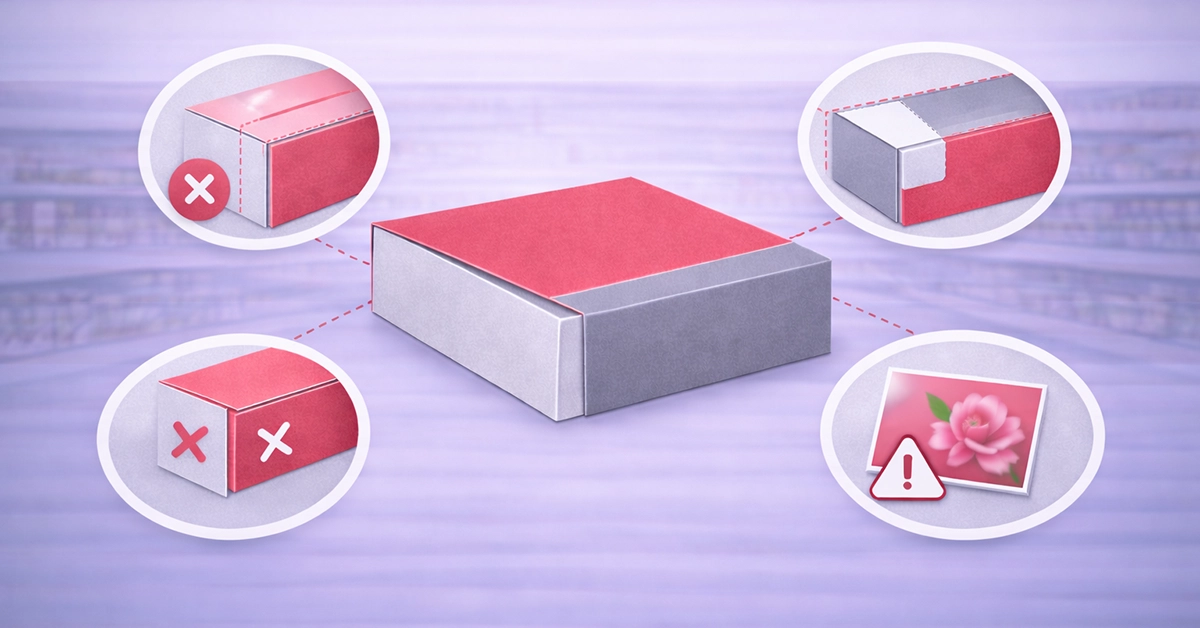
Unlike flat print items, box sleeves wrap around a three-dimensional structure. This means artwork must align accurately across multiple panels, folds, and overlaps.
Key factors that make box sleeve artwork more complex include:
Many issues arise when artwork is designed visually first and technically second. For packaging, technical accuracy must come first.
Incorrect sizing is one of the most costly artwork mistakes in box sleeve printing. Even minor inaccuracies can cause text to wrap onto the wrong panel or imagery to misalign once assembled.
Common dimension-related issues include:
How to prevent these problems:
Bleed and safe zones are essential in print, yet they are frequently overlooked in packaging artwork.
When bleed is missing or insufficient, issues such as white edges or uneven trimming can occur. Ignoring safe zones can result in text or logos being cut off or distorted by folds.
Best practice guidance includes:
Images that appear sharp on screen can look soft or pixelated in print if they are not suitable for production.
Typical problems include:
To maintain print quality:
Colour is another area where artwork often falls short. Screen colours rarely match printed output unless artwork is prepared correctly.
Common colour setup mistakes include:
To minimise colour issues:
Text-related issues can cause last-minute delays and layout changes if not handled correctly.
Frequent font problems include:
Best practice recommendations:
Box sleeves often include finishes such as lamination, foiling, or spot effects. These require additional preparation within the artwork file.
Common errors include:
To avoid these issues:
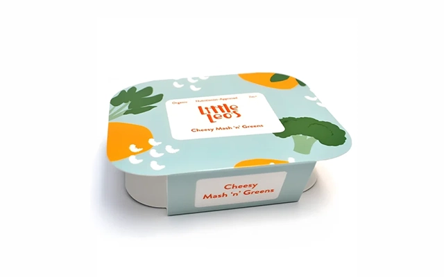
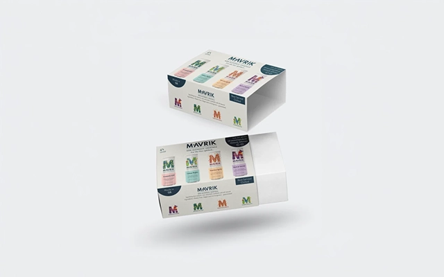
The table below summarises key artwork requirements for box sleeves.
| Artwork Element | Best Practice Guidance | Risk if Ignored |
|---|---|---|
| Dimensions | Use confirmed flat size with clear panel mapping | Misaligned panels and wraps |
| Bleed | Include bleed on all edges | White edges after trimming |
| Safe zones | Keep text away from edges and folds | Cropped or unreadable content |
| Image resolution | Use print-quality images | Pixelation and blurred visuals |
| Colour setup | Work in print-ready colour modes | Unexpected colour shifts |
| Fonts | Outline or embed all fonts | Text substitution or reflow |
| Finishes | Supply separate, labelled layers | Misplaced or missing effects |
| File format | Export as a print-ready PDF | Delays or file rejection |
Even well-prepared artwork can be rejected if supplied in the wrong format.
Problems often arise from:
To avoid delays:
A final artwork review can catch most issues before they become expensive problems.
Key checks include:
Correct artwork setup is essential to producing high-quality box sleeves that look professional and perform as intended. Most common errors are caused by small oversights rather than poor design, which makes them entirely preventable.
By understanding technical requirements, following proven best practices, and carrying out a structured final check, you can reduce delays, avoid reprints, and achieve reliable results every time.
If you are preparing artwork for box sleeve printing and want confidence before production, reviewing your files carefully or seeking professional artwork checks can make all the difference.

Unit 4-10 Stanton Road Ind. Est.
Stanton Road
Southampton
Hampshire
United Kingdom
SO15 4HU