Preparing artwork for printed custom boxes is a crucial stage in packaging production. Even a minor issue in colour setup, alignment, or resolution can lead to delays, reprints, or packaging that does not represent your brand correctly. When artwork is prepared with precision, the final output becomes more predictable, consistent, and cost-effective.
This guide explains how to prepare print-ready artwork for packaging, including colour profiles, dielines, tolerances, and essential pre-press checks. It is designed for designers, marketers, print buyers, and anyone supplying artwork for packaging production in the UK.
Packaging artwork is not simply a creative asset; it functions as a technical document used throughout the production process. Every line, colour, and layer must translate accurately into print, cutting, finishing, and assembly.
Strong artwork setup ensures:
Organisations such as the British Printing Industries Federation (BPIF) highlight artwork accuracy as a key factor in reducing waste and improving production effectiveness.
Each print method interprets artwork differently, which means the setup must match the production process.
For additional context on print processes, see FESPA UK’s technical resources.
Colour inconsistency is one of the most frequent issues in packaging. Without the right ICC profile, colours may shift drastically during printing.
RGB colours appear vibrant on screens but cannot be reproduced accurately in print. Supply artwork in CMYK to avoid unexpected results.
Further information on colour profiles is available from the ICC at https://www.color.org.
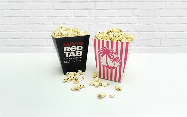
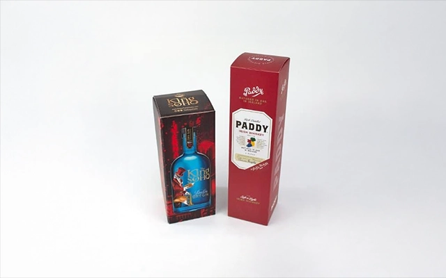
Pantone colours are ideal for logos, corporate colours, and packaging requiring consistent colour reproduction across multiple materials.
Ink absorption, surface coatings, and board shade influence printed colour. Correct profiling reduces inconsistencies and helps maintain brand integrity.
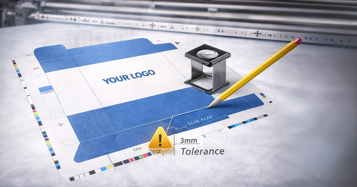
Dielines define the physical structure of your packaging. Incorrect dielines can lead to faulty folding, incorrect panel alignment, or artwork appearing in unintended areas.
A well-prepared dieline ensures artwork aligns perfectly with the box’s structure.
Packaging production involves movement during cutting and folding, so your artwork must account for these tolerances.
Add 3–5 mm beyond the trim line to avoid unwanted white edges.
Keep essential text and graphics at least 5–7 mm inside the trim and fold lines.
Understanding tolerances helps prevent misalignment and unintended cropping.
| Artwork Element | Recommended Standard | Notes |
|---|---|---|
| Colour Mode | CMYK only | Avoid RGB; use matching ICC profiles |
| Colour Profiles | FOGRA39, FOGRA51 | Improves colour accuracy |
| Bleed | 3–5 mm | Prevents white edges after cutting |
| Safe Zone | 5–7 mm | Protects key content |
| Image Resolution | 300 dpi | For sharp photographic quality |
| Fonts | Outlined or embedded | Prevents font substitution |
| Dieline | Vector, separate layer | Label lines clearly |
| Trapping | Apply as needed | Prevents white slivers |
| Finishing Layers | Separate layer in spot colour | Foil, varnish, emboss, white ink |
| Total Ink Coverage | 280–320 percent | Avoids drying and marking issues |
These technical details are essential for producing crisp, legible print.
Supply all photographic elements at 300 dpi minimum.
Following these guidelines ensures clarity and prevents ink spread from reducing legibility.
These settings play a significant role in preventing print defects.
Black text should normally overprint to improve registration. Always enable overprint preview when checking artwork.
Apply subtle overlaps between colours to avoid white gaps caused by movement on press. This is especially important for flexographic printing.
Keep total ink coverage within 280–320 percent, depending on substrate and press type. Excessive ink can cause drying issues, smudging, or print marking.

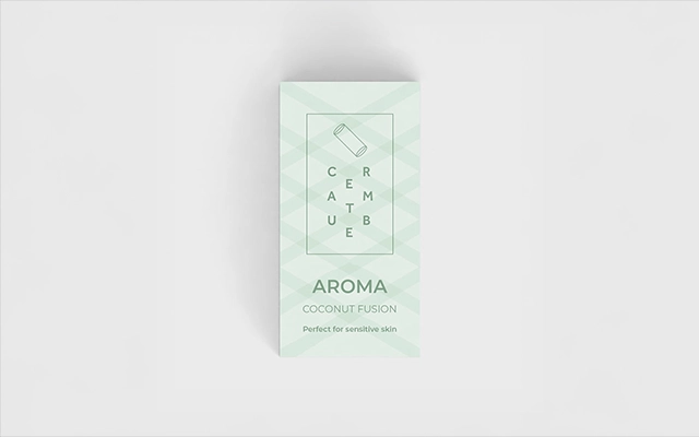
Finishing options require precise technical setup for accurate application.
This clarity ensures finishing treatments are applied exactly where intended.
Different boards produce different visual results. Adjusting artwork based on substrate is essential.
Absorbs more ink, resulting in softer colours. Avoid delicate gradients and subtle details.
Provides more consistent colour but still shows surface texture.
Delivers high detail and strong colour accuracy, particularly for lithographic printing.
Understanding how ink behaves on each substrate helps produce predictable results.
Preventable issues often cause production delays. The most frequent include:
Avoiding these errors speeds up artwork approval and ensures smoother production.
Before submitting artwork, confirm the following:
This checklist helps ensure artwork is ready for production without costly revisions.
Accurate, well-prepared artwork is fundamental to producing high-quality printed packaging. When artwork follows correct colour management, structural layout, and pre-press principles, production becomes faster, more predictable, and more cost-effective.
If you are preparing artwork for custom packaging and want expert guidance, or need professionally designed templates to work from, support can be provided at any stage. Whether you are producing cartonboard packaging, corrugated boxes, or bespoke printed designs, the right artwork preparation ensures your packaging prints exactly as intended.

Unit 4-10 Stanton Road Ind. Est.
Stanton Road
Southampton
Hampshire
United Kingdom
SO15 4HU